With the upcoming release of Tribler 5.4, it's time to look back at the history of Tribler.
Background and versions prior 5.0
Tribler is a peer-to-peer (P2P) file-sharing application that's being developed at the Delft University of Technology and the Vrije Universiteit Amsterdam. The universities' researchers started the Tribler project in 2005 by forking ABC 3.x (Yet Another BitTorrent Client) and adding social features to it. By introducing notions of friends and "taste buddies" (people with similar tastes), download speeds could be improved and recommendations could be given to the users. Visually, Tribler 3.x did not differ much from ABC as can be seen below. |
| Tribler 3.x. More screens available at Web Archive. |
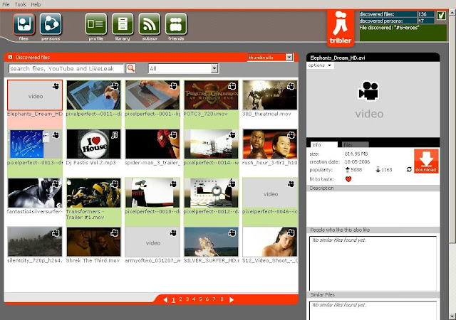
Tribler's GUI was given a facelift and contained a bunch of new features with the introduction of the 4.x series in 2007. People could now search for files in the Tribler network (instead of browsing in 3.7) and play them in a streaming fashion instead of downloading the full file first. The 4.x series also allowed users to view content from other video sources like YouTube, but this feature was short-lived and was scrapped starting with Tribler 5.0.
 |
| Tribler 4.x. |
The 5.x series
With a new major version number, a completely new GUI was introduced yet again in 2009. The old GUI of the 4.x series was deemed to be clunky, so for Tribler 5.0, a minimalistic look was chosen. This also meant that a lot of old features like cooperative downloading were no longer visible or accessible.
Users who started Tribler 5.0 were greeted with a screen like the one below. It only contained a search box, your current sharing reputation and two links to change your settings and view your downloaded files.
Users who started Tribler 5.0 were greeted with a screen like the one below. It only contained a search box, your current sharing reputation and two links to change your settings and view your downloaded files.
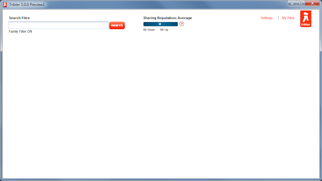 |
| Main screen of Tribler 5.0. |
In 4.x, when you searched for files, the results were presented in a grid with thumbnails. This approach, however, had problems like most results not having a thumbnail at all, so it was dropped in 5.x and instead the search results were displayed in a list.
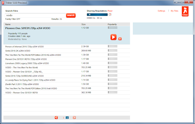 |
| Search results in Tribler 5.0. |
Version 5.1.x introduced some minor changes based on community feedback. Most of the visual changes can be found by comparing the two screenshots depicted below.
 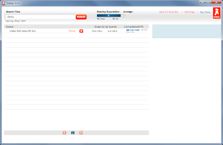 |
| Tribler 5.1 (right) introduced minor changes. |
New features were introduced again starting from version 5.2. Tribler 5.2 introduced the concept of channels similar to YouTube. Channels allowed users to publish BitTorrent files and to subscribe to channels. Channels help with reducing the flow of spam by favoring content from popular channels. Unfortunately, users did not receive direct benefit by subscribing to channels. For example, they were not notified when new content was available in their subscribed channels.
The introduction of channels caused the search box to change. A drop-down menu allowed users to switch between searching for files and channels. There was also a minor change in how search results were displayed. Instead of showing a file's "popularity", the number of BitTorrent seeders and leechers were shown. This change, however, was of temporary nature as Tribler 5.3 reintroduced the notion of popularity again.
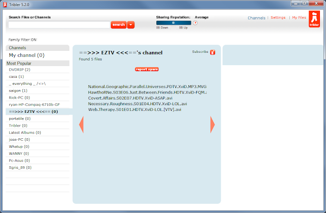 |
| Channels appearing for the first time in Tribler 5.2. |
Tribler 5.2 also shipped with some code I had written. Tribler was given a "RePEX" mode that was enabled for completed, but inactive downloads. In short, the RePEX mode periodically keeps in touch with previously seen peers in a download swarm. This mode was developed as an alternative way of doing distributed tracking, but so far it is not being used to its full extent. While Tribler peers are currently tracking swarms using RePEX, the information gathered through this process cannot be queried yet by others.
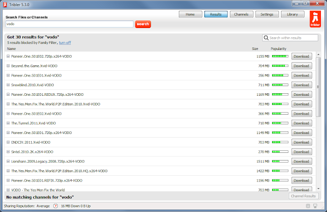 |
| The GUI in Tribler 5.3 was made to look more native. |
The GUI was changed again in Tribler 5.3, although not as radical as with the transitions to 4.0 and 5.0. Most custom GUI widgets were replaced with native controls. Further changes included the pagination of the search results being replaced by a single scrollable, sortable and filterable list, the settings screen being replaced by a dialog window, and the search box's behaviour being changed to perform both file and channel search simultaneously.
The formerly empty main screen of Tribler was also changed. We found that many new users were not able to formulate successful queries. To address this issue in Tribler 5.3, users were now greeted with an animated term cloud (code-named "NetworkBuzz" and developed by yours truly, amongst others), which showed what's hot in the Tribler network. Clicking on any of the terms would initiate a search. To allow people to go back to the main screen, a "Home" button was included in Tribler's navigation row.
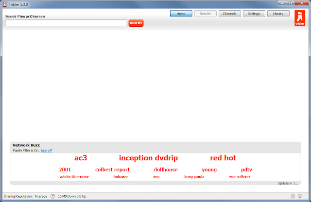 |
| "NetworkBuzz" making its appearance in Tribler 5.3's main screen. |
Beyond Tribler 5.3
For now, this concludes the history of almost 6 years of Tribler. The Tribler project is still alive and kicking, and thus its history is being written as we speak. What will the future bring us? Who knows, but for the time being it will be Tribler 5.4.
| Sneak peak of Tribler 5.4. |
No comments:
Post a Comment